How to Choose the Perfect Color Palette
Choosing the perfect color palette for your home is more than just picking your favorite shades. Colors have the power to set the mood, enhance your space, and reflect your personality. Whether you’re redecorating a single room or designing an entire house, the right palette will create harmony and balance. From calming neutrals to bold accents, your color scheme plays a huge role in how your space feels. In this guide, we’ll break down practical steps, expert tips, and creative ideas to help you select colors that not only look beautiful but also make your home truly feel like yours.
Understand the Psychology of Colors
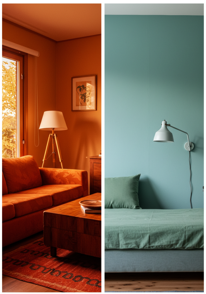
Every color affects our emotions differently. Warm tones like red, orange, and yellow bring energy and vibrance, while cool tones like blue, green, and purple promote calm and relaxation. If you want a cozy, intimate space, opt for warmer shades. For a peaceful and serene atmosphere, stick to cooler colors. Understanding this psychology helps you make informed choices for each room. For example, bedrooms often benefit from soft blues or earthy tones, while kitchens and living rooms look great with energizing colors. Remember, the right shade can completely transform the mood of a space without changing its layout.
Start with a Base Color
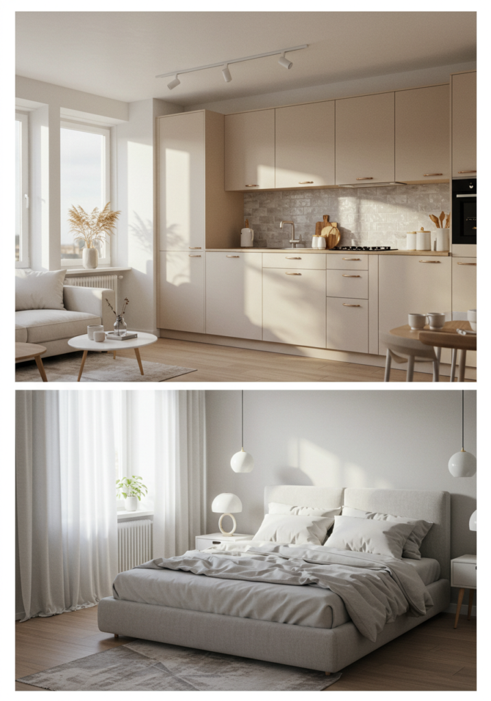
Your base color is the foundation of your palette. This is usually a neutral shade like white, beige, gray, or cream that covers the majority of your walls or large furniture. A strong base color gives your space a timeless and versatile backdrop, allowing you to add accents and patterns more easily. The base should be something you won’t get tired of quickly, as it sets the overall tone. Once your base is chosen, you can layer in secondary and accent colors to create depth and interest. This method ensures your palette feels cohesive and well thought out.
Use the 60-30-10 Rule
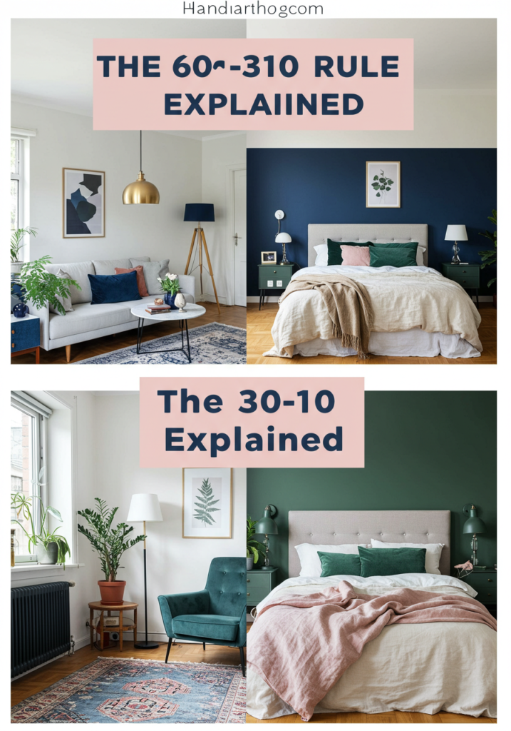
The 60-30-10 rule is a simple interior design formula for balancing colors in a room. It means using your dominant color for about 60% of the space (walls, large furniture), a secondary color for 30% (upholstery, rugs), and an accent color for 10% (pillows, art, accessories). This proportion keeps the design visually appealing and avoids overwhelming the eye. For example, you could have a white base (60%), soft gray furniture (30%), and gold accents (10%). This technique works with any style, from modern minimalism to bohemian chic, and helps you confidently mix and match without making mistakes.
Consider Lighting Conditions
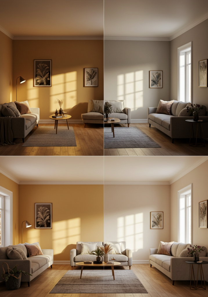
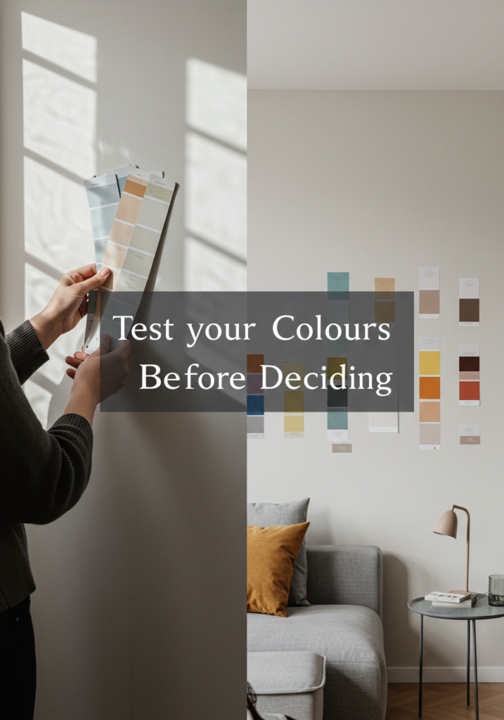
Lighting plays a huge role in how colors appear. Natural sunlight brings out true tones, while artificial lighting can alter them. A paint color that looks perfect in the store might seem completely different in your home. Warm lighting can make cool colors feel more inviting, while bright white lighting might make them appear sharper. Always test paint samples on your walls and view them at different times of the day before committing. This way, you’ll see how the color behaves in morning light, afternoon sunshine, and evening lamplight, ensuring you love the look in every condition.
Take Inspiration from Nature or Art
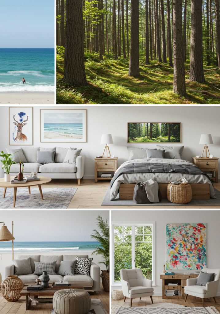
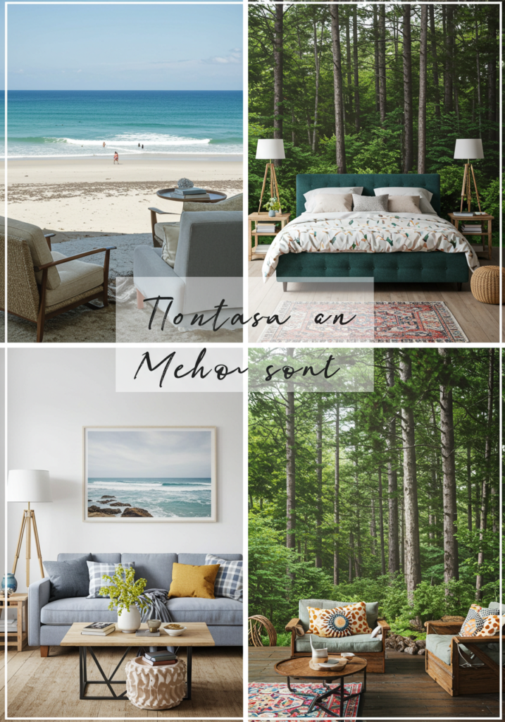
If you’re unsure where to start, look outside your window or at your favorite piece of art. Nature provides countless harmonious color combinations think ocean blues and sandy beiges, or forest greens paired with earthy browns. Artwork, textiles, or even a patterned rug can also inspire your palette. These sources often have a balance of colors that naturally work well together. By pulling shades from an image you already love, you’re guaranteed to create a cohesive look. Plus, inspiration from nature or art adds a personal touch to your home, making the space feel unique and intentional.
Don’t Forget Texture and Material
Color is only one part of the equation; texture and materials influence how shades appear. A matte finish will make a color look soft and muted, while a glossy finish makes it more vibrant. The materials in your room like wood, metal, fabric, or stone also interact with colors differently. For example, a deep navy might feel sophisticated with velvet but more casual with cotton. Considering these elements ensures your palette looks rich and layered. Mixing different textures while sticking to your chosen color scheme will make your home feel polished and professionally designed.
Test Before You Commit
Never skip the testing phase. Even if you think you’ve found the perfect palette, it’s important to see how it works in your actual space. Purchase small paint samples, or use peel-and-stick swatches, and apply them to different walls in your room. Live with them for a few days and notice how they change with lighting and time of day. You can also bring home fabric samples for curtains, pillows, or rugs to see how they coordinate. Testing prevents costly mistakes and ensures your final choice will make you happy for years to come.
Conclusion
Selecting the perfect color palette isn’t just about trends — it’s about creating a space that feels like home. By understanding color psychology, choosing a strong base, balancing with the 60-30-10 rule, and considering lighting and textures, you can craft a harmonious look that reflects your style. Take your time, draw inspiration from the world around you, and test before making final decisions. With the right colors, your home will not only look beautiful but also feel welcoming, comfortable, and truly yours.

